CLIENT
TripDoodler
brand identity framework and visual guidelines update, expansion, and refresh for the world's first sustainable travel application. I worked with a previously created logo and the original "TripDoodler" blue to expand on their branding. I created custom icons, photo treatments, as well as social advertisements, and prototypes for their mobile app. For photography and video, I worked with a photographer/filmmaker to make sure the outputs were aligned with the branding.
branding design, creative direction, illustration.
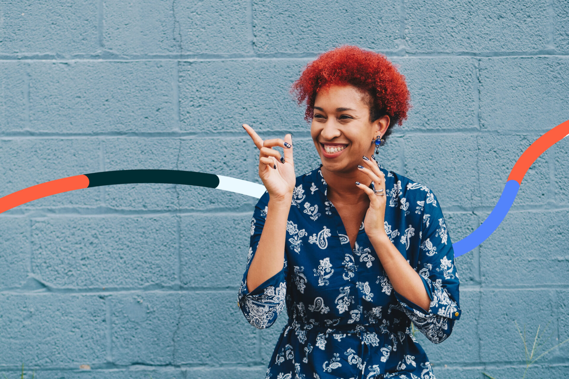
TripDoodler requested a graphic element to make their images stand out more so than all of the other travel images flooding the internet.
Using their colors and the "doodle" in "TripDoodler," Somewhere created a graphic element to represent the travelers journey.


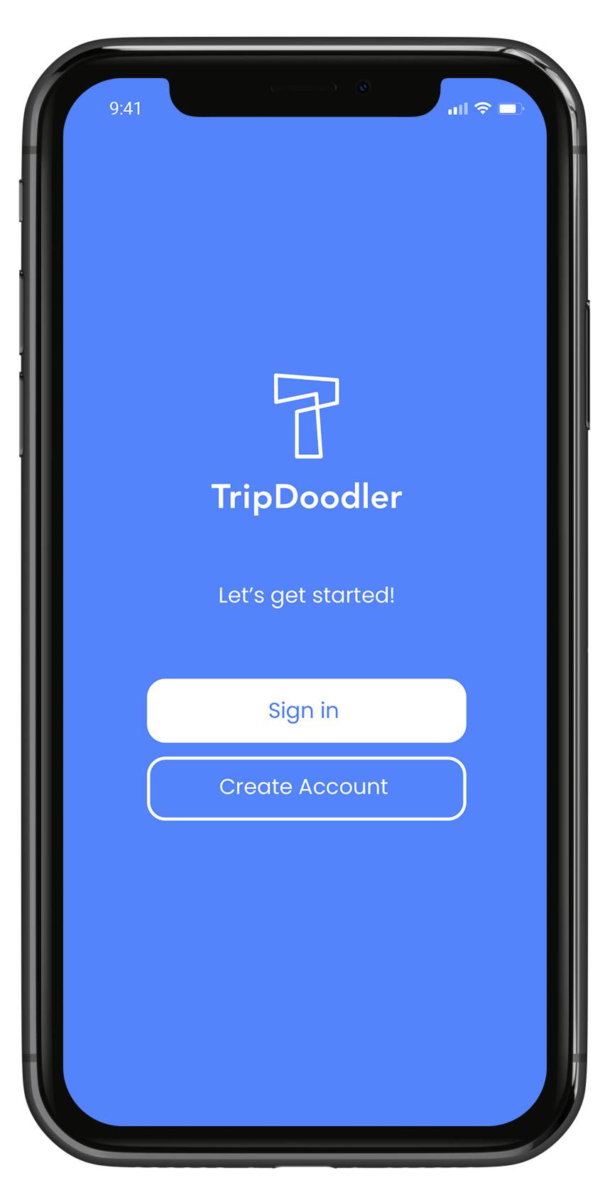
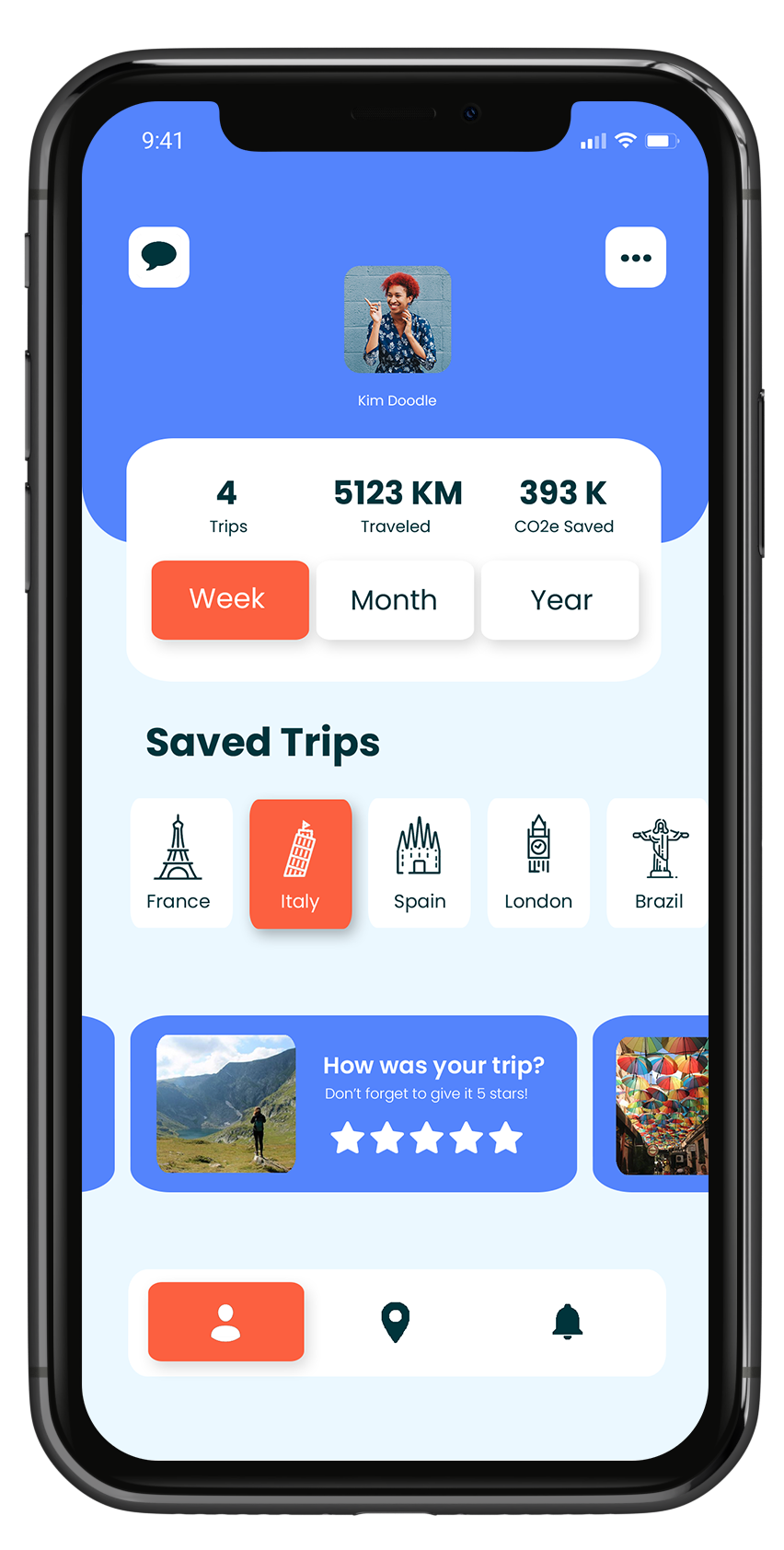
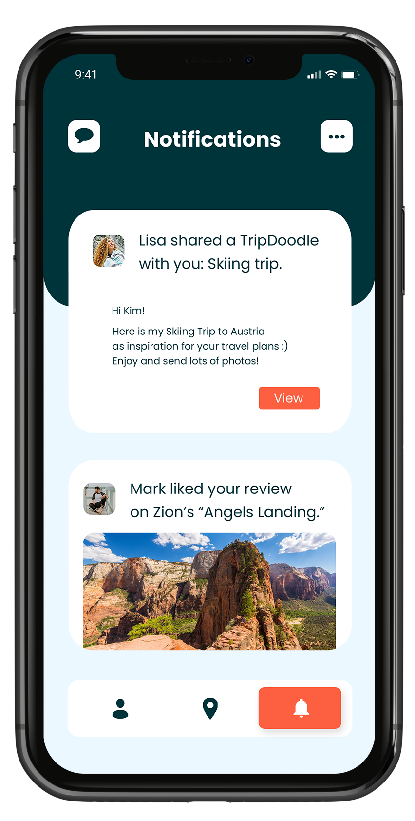
Creative direction and wireframes were also crafted for TripDoodlers in-development iOS mobile application.

Along with this refresh, TripDoodler also asked us to create a photography bank for digital, print, and traditional medias. A few select images can be seen below.


